

Table of contents
Media Query
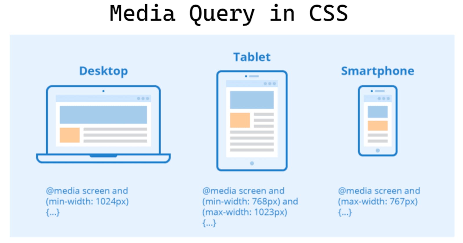
Media query is a technique for making responsive webpages. With media qquery we can devide multiple elements list as row and column.
Syntax - @media media-type (media-feature) operator (media-feature)
@media -It is keyword for media writing, it uses under<style> _ _ _ _ _ _ </style>then define things.- media-type - given here media type usually it is 'screen'.
- media-feature - here we give min-width or max -width where media query is run.
- operator - here we can give operator, that work between two media feature.
Example - @media screen (min-width:680px) and (max-width:999px) { _ _ _ }
for min-width:1000; - background-color of container is changing
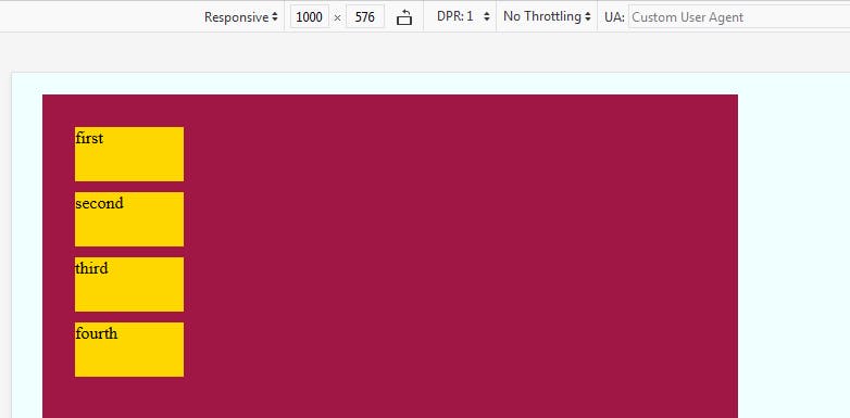
@media (min-width:1000px) {
            .container {
                background-color: rgb(160, 22, 68);
            }
        }
for (min-width:680px) and (max-width:999px) - elements attributs are changing
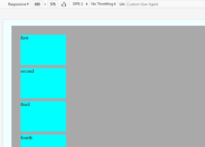
@media (min-width:680px) and (max-width:999px) {
            .all {
                height: 100px;
                width: 150px;
                background-color: aqua;

            }
        }
for (max-width:380px) - again elements attributs are changing
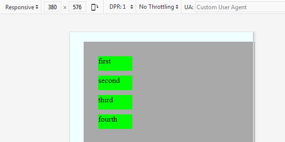
@media (max-width:380px) {
            .all {
                height: 30px;
                width: 70px;
                background-color: lime;

            }
        }
You see how media query work between min-width and max-width
Complete Code Here
<!DOCTYPE html>
<html lang="en">
<head>
    <meta charset="UTF-8">
    <meta http-equiv="X-UA-Compatible" content="IE=edge">
    <meta name="viewport" content="width=device-width, initial-scale=1.0">
    <title>Document</title>
    <style>
        body {
            background-color: azure;
        }
        .container {
            width: 600px;
            height: 500px;
            background-color: darkgray;
            margin: 20px;
            padding: 20px;
        }
        .all {
            height : 50px;
            width: 100px;
            background-color: gold;
            margin: 10px;
        }
        @media (max-width:380px) {
            .all {
                height: 30px;
                width: 70px;
                background-color: lime;

            }
        }
        @media (min-width:680px) and (max-width:999px) {
            .all {
                height: 100px;
                width: 150px;
                background-color: aqua;

            }
        }
        @media (min-width:1000px) {
            .container {
                background-color: rgb(160, 22, 68);
            }
        }
    </style>
</head>
<body>
    <div class="container">
        <div class="all">       first  </div>
        <div class="all second">second </div>
        <div class="all">       third  </div>
        <div class="all">       fourth </div>
    </div>
</body>
</html>
Thankyou for reading, give suggestion if any